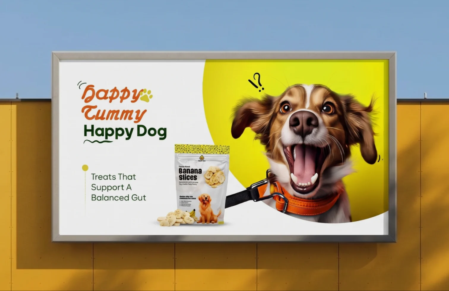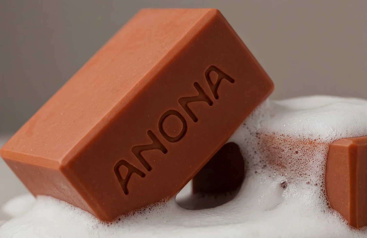
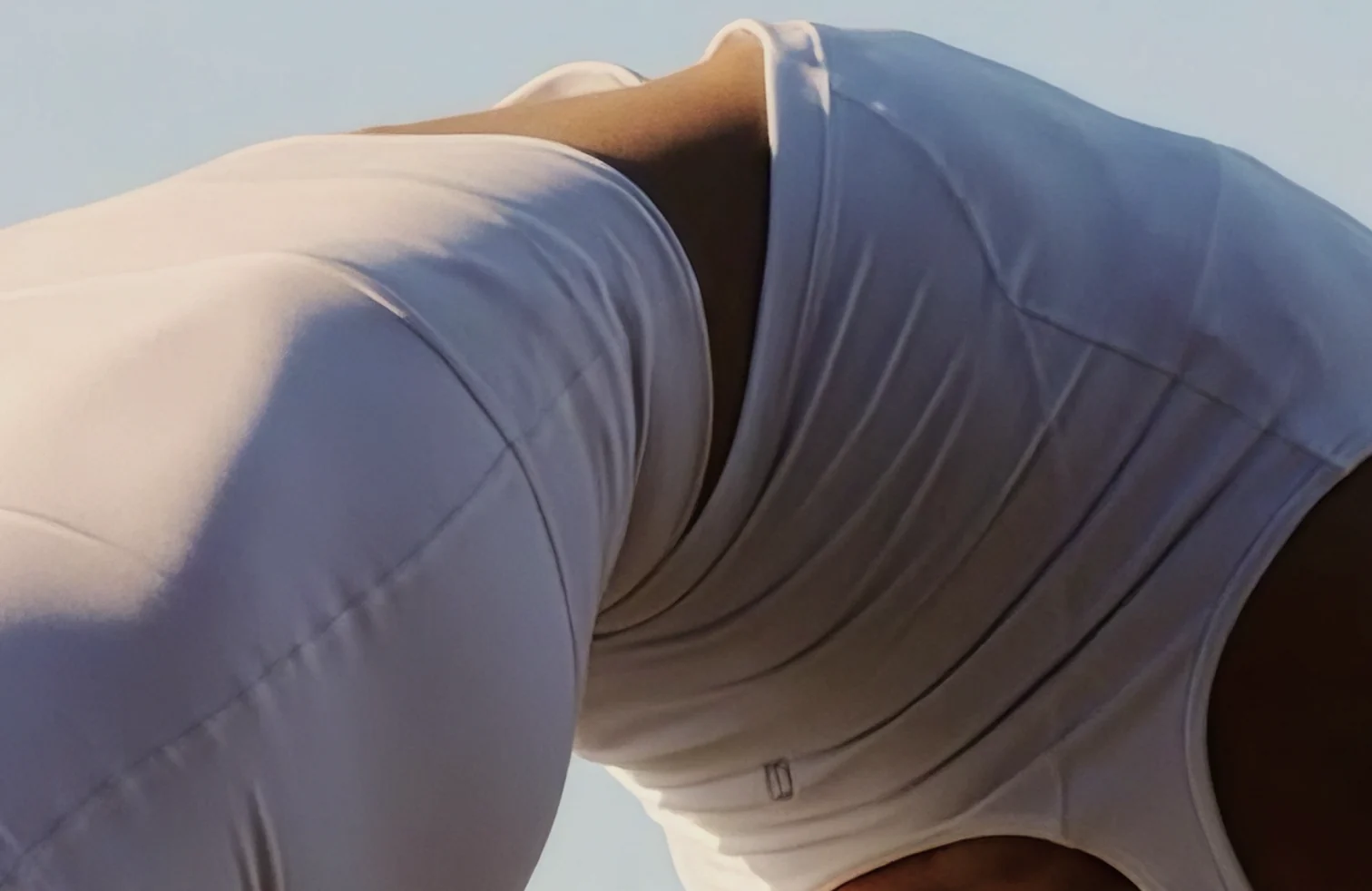
A product brand distilled to essentials: mark, palette, label.
Giving EEVE a calm, precise identity that lets the product speak.
Minimal is easy to say and hard to do. EEVE needed restraint with enough character to be remembered.
A tight system, logo, palette, label, print, nothing decorative, everything deliberate.
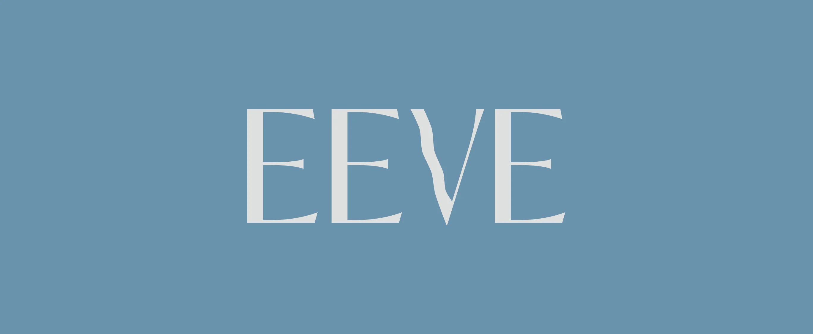
Primary logo
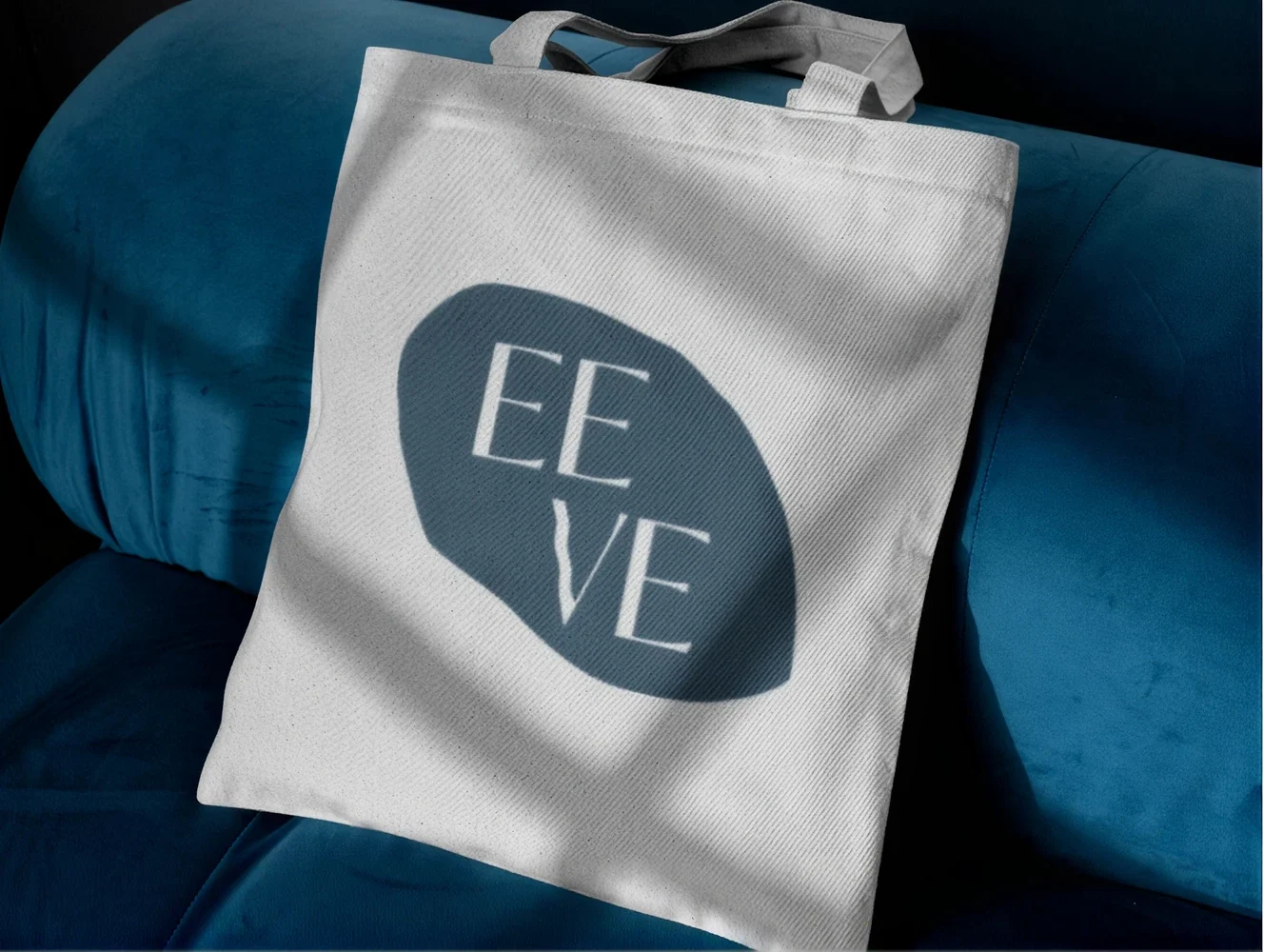
Logo application
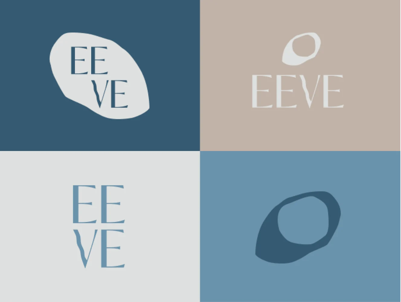
Logo design
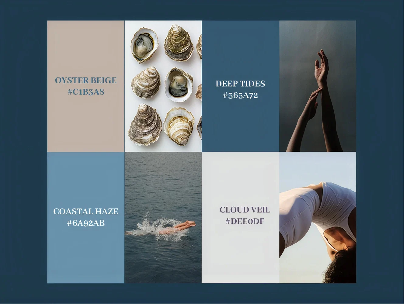
Colour palette

Poster design
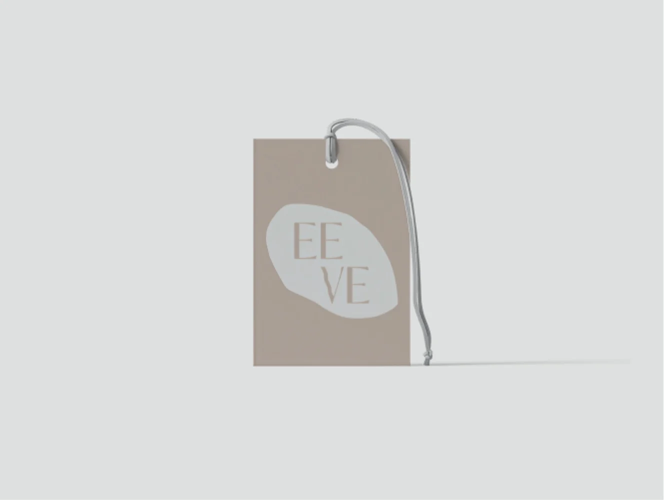
Label design

Card design
.
What our clients say.
ALL TESTIMONIALS


Working with Kaya was such a great experience. She has an exceptional eye for aesthetics, a very personal approach, and a level of professionalism that made the whole process feel effortless. As I was building EEVE from the ground up, I didn’t have complete clarity yet: even the name and visual direction were still evolving. I’m especially grateful that they never rushed my decisions, gave me space to change my mind, and were always willing to talk things through...
Working with brands that matter