


Food & lifestyle
Identity, packaging and growth for F&B concepts and premium lifestyle products; brands that have to look worth it on a shelf and in a feed.
The reality
In food and lifestyle, products and formulas
are easily copied; the only
true differentiator is
the brand world built around them.
That brand world must survive brutal compression on a small jar lid or a digital screen; most identities look great on slides but fail in reality.
What we solve
Shelf and feed compression
The mark has to survive a 40mm jar lid and a thumbnail. We design systems that stay recognisable at both ends of that range, not only at presentation size.
Premium pricing justification
Positioning, materials and art direction that make a higher price feel obvious rather than optimistic.
Launch without distribution
D2C first: a store experience, content engine and paid acquisition that prove demand before retail negotiations.
Copycat pressure
Ownable assets; colour, structure, voice, ritual; that competitors cannot lift without looking derivative.
Services that move this sector
Where we start.
Proof in this sector
Miznier
Matcha moved from supplement shelf to design object; a premium identity and responsive design system for European lifestyle retail.
Read the case study↗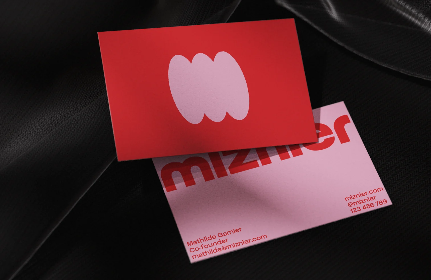
More projects
in this space.
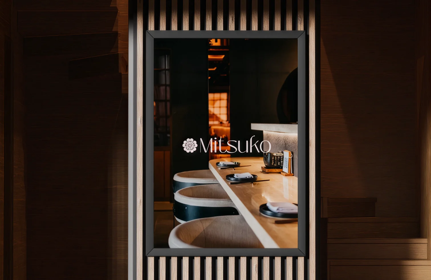
Sector-relevant work and adjacent projects where the same playbook applied.
FAQ.
Do you design packaging and dielines?

Yes. Structure, print-ready dielines, material and finish direction, and the artwork files your printer needs. We work with your converter from the start so the design that ships is the design that was approved.
Can you handle a restaurant brand end to end?
Name, identity, menu system, signage, packaging, website and the social engine that keeps it visible. We hand over templates your team can run, so the brand does not stall between visits from an agency.
How do you approach food photography?
Shot lists built from what the brand actually needs to sell (hero, texture, ritual, lifestyle), produced as a repeatable system with lighting and styling notes, so the next shoot matches the first one.
We are pre-revenue. Is a full brand worth it?
Rarely all at once. We usually start with positioning, a core mark and the packaging or landing page you need in order to sell (three to five weeks), then extend the system once the product has proved itself.