

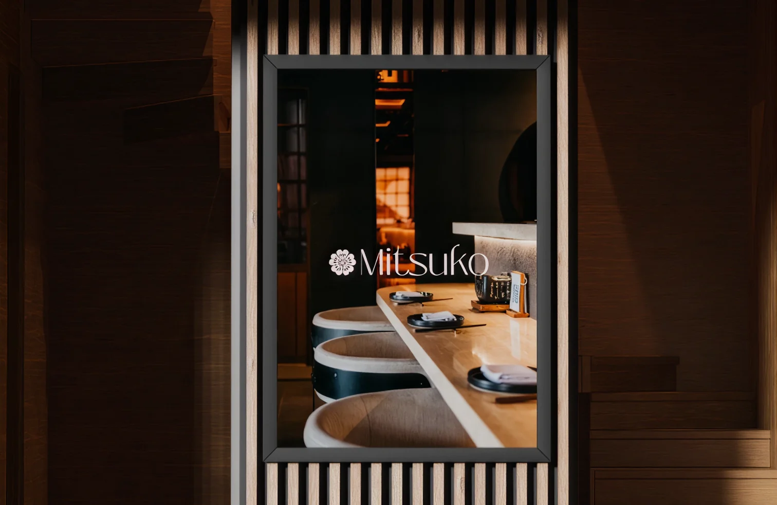
Mitsuko
A Japanese dining brand with a soft, floral identity carried from the menu to the coaster.
THE BRIEF
Creating Mitsuko an identity as considered as its menu.
THE CHALLENGE
Japanese dining branding swings between cliché and cold minimalism. Mitsuko needed softness with discipline.
THE APPROACH
A floral mark and muted palette applied across menus, coasters, and the social presence.
THE WORK

Primary logo
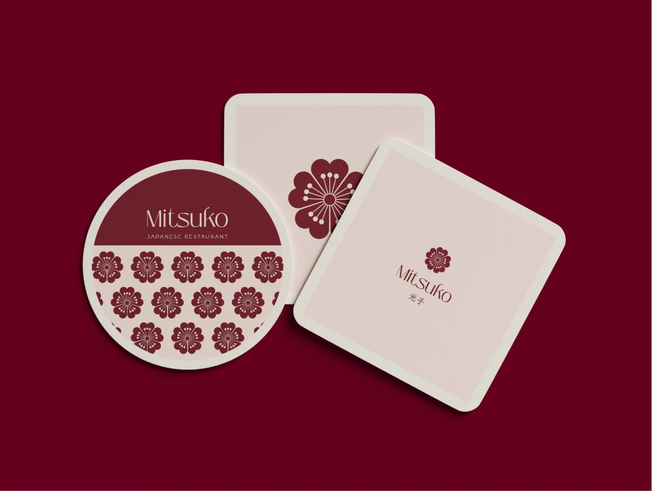
Coaster design
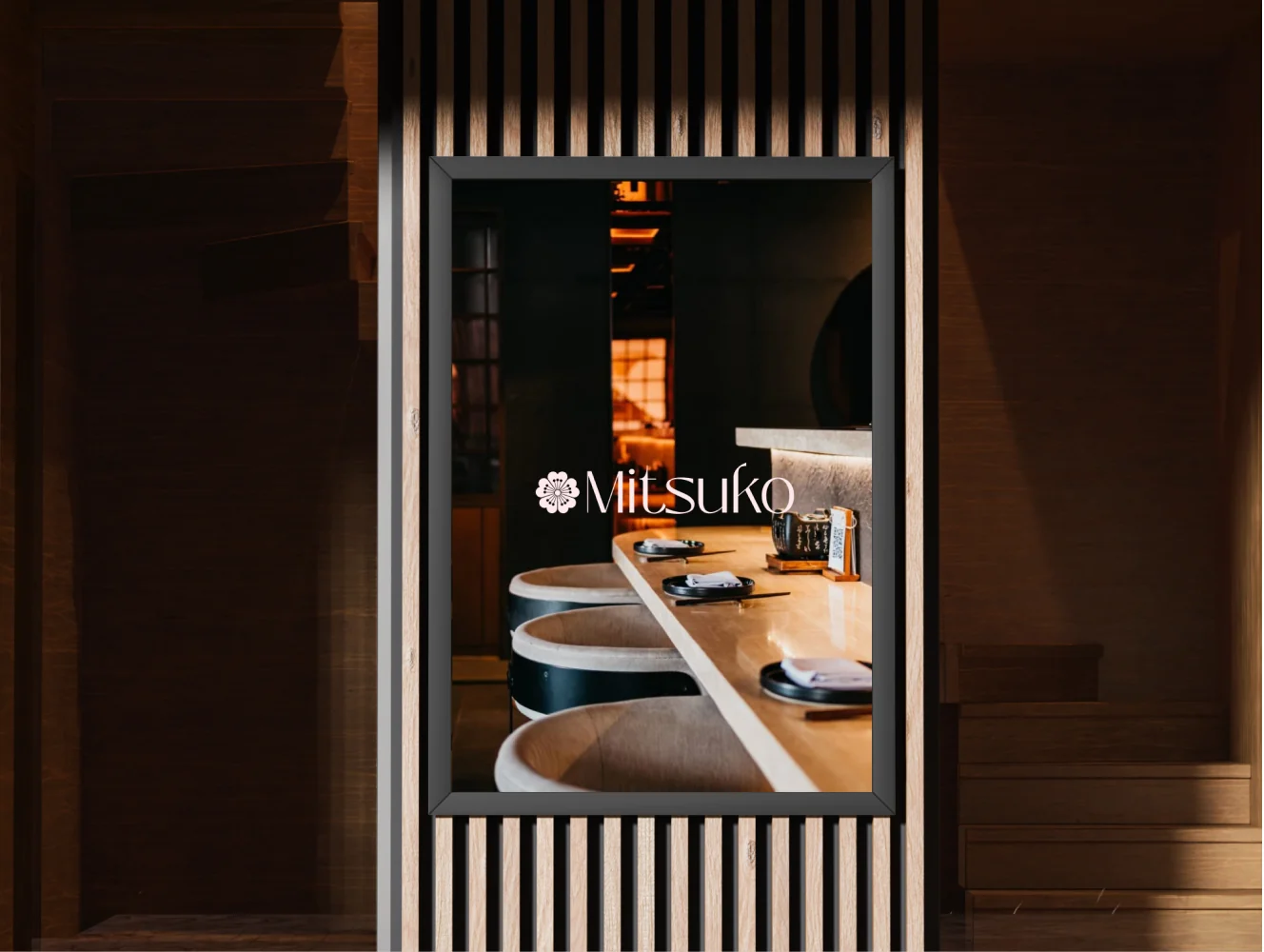
Banner
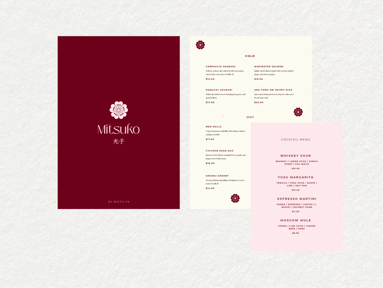
Menu design
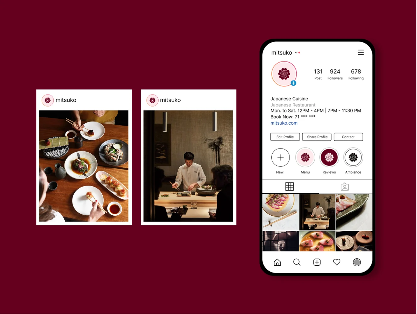
Social media
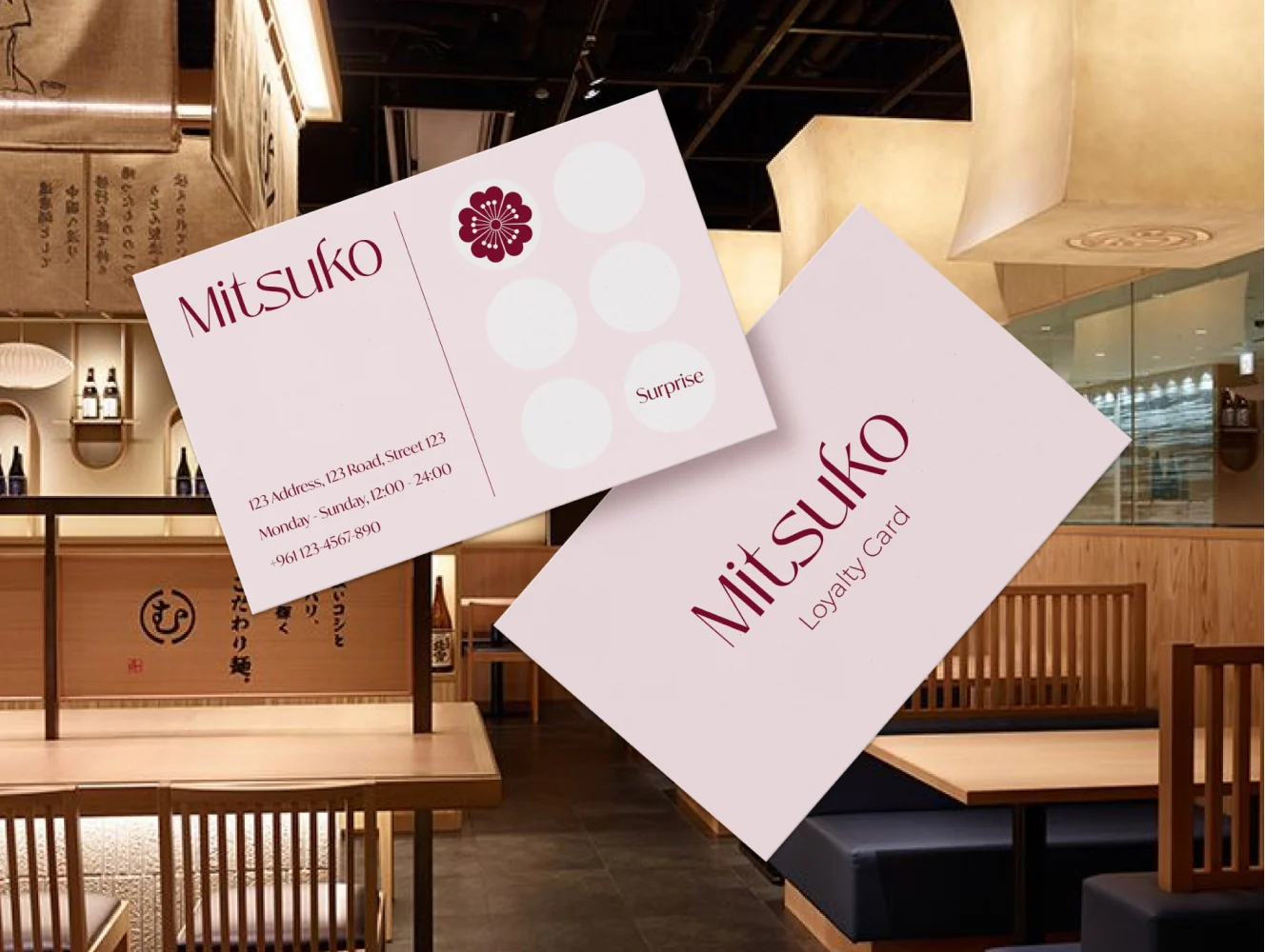
Business card
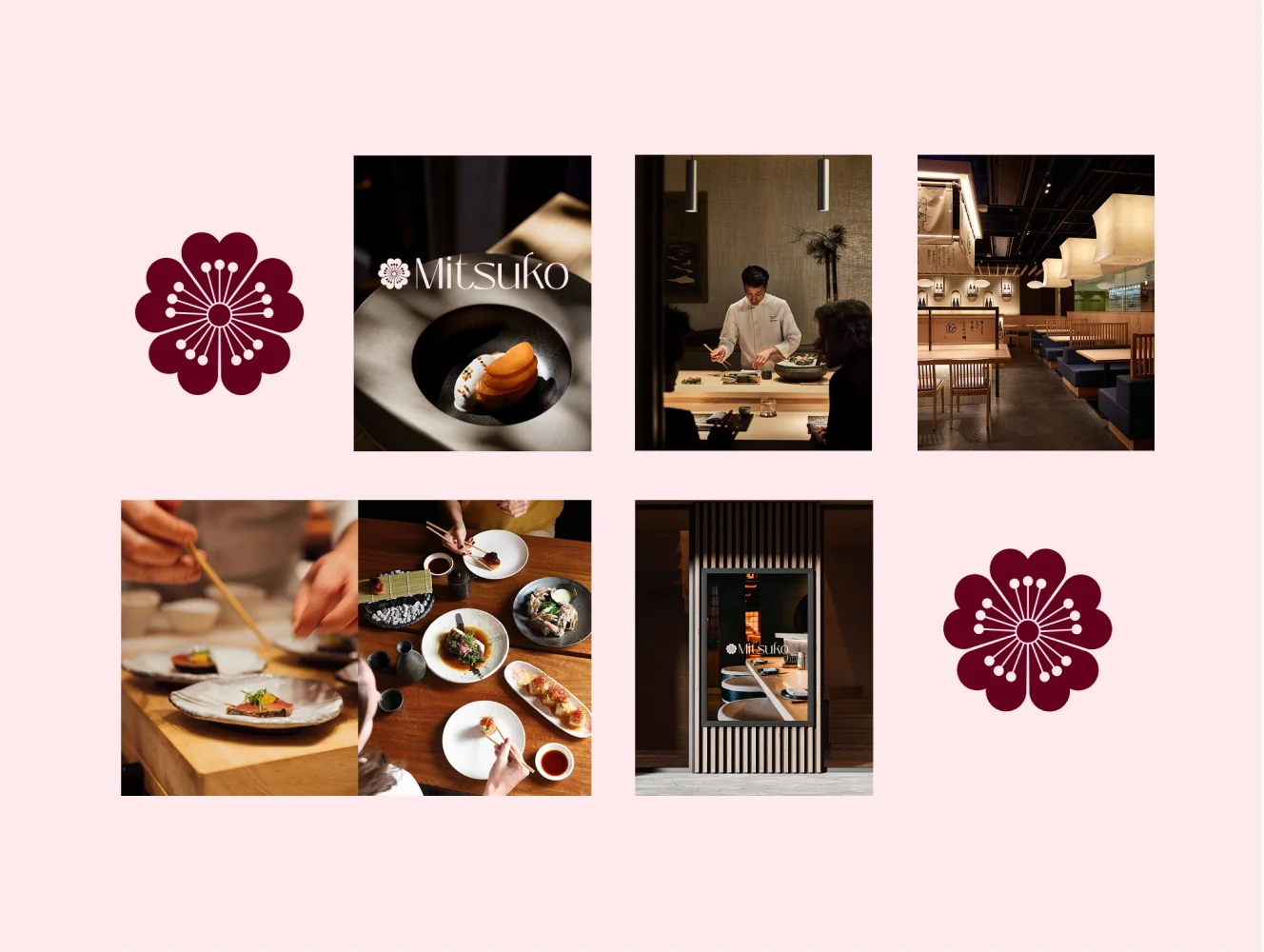
Visual direction
Testimonials
.
What our clients say.
ALL TESTIMONIALS


MULD existed before ALIF, but it didn't look like itself until they got involved. They gave us a wordmark with real character and carried it through everything we hand to customers, the packaging, the cards, the stickers, even the tote. Nothing feels like an afterthought. The process was straightforward, deadlines held, and every feedback round made the work better. If you care how your brand feels in someone's hands, this is the team.